


Christine - Text, Hair and Boas
May 29, 2008 20:11:13 GMT
Post by Administrator on May 29, 2008 20:11:13 GMT
Originally posted by ChristinaChaos, reposted by Lyran when the forum moved.
PSP
When working with text that the letters are spaced too close togethor, change the kerning to space them out. While the changes won't show up in the text box, if you move the box and look at the graphic, you can see the changes there. The higher the number, the further apart they are. The lower (negative) the number, the closer they are.
Especially handy in blinkie-ing, to make sure your text is centered, select the Vector layer your text is on, then go to the object selector tool, select your text, right click on it, then go to Align Object, then Center of Canvas. That way you'll know your blinkie text (or what have you) is dead center on.
Photoshop
Realistic hair can be made by 'noising' a color, then using the motion blur to pull it out. Sounds kinda weird to describe, but try it and you'll see.
Here's how I make boas/fur. While I normally do them in PSP, they can be done is Paint just as easily.
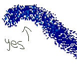
First off, you need to pick 4 or 5 different colors for your palette. I just choose 4 to begin with.

Then with the medium setting of the airbrush (though in reality the size will vary on what you're doing) or around 8 in PSP (hardness 100, opacity around 100, though varies with what effect you're going for, step 34, density 9), draw the base of your boa.
In paint you may have to go over it a couple of times to get it filled in well.

Then take your next darkest color and go over your outline. However, don't just click and drag. Click once and then move your mouse before clicking again. This method gets even more important as your progress through the colors.
In PSP I probably would have dropped the density down by 2, as well.
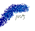

As my next shade is my brightest, I tend to use a little bit more of it than the other 3 shades (not counting the base color). Still use the position and click method though, as dragging it will add too much of the shade.
Finally, with your lightest shade selected, sparingly go over it one last time. You want enough of it to be visible, but you don't want it to be overpowering. That's reserved for the brightest shade, lol.
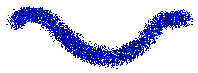
Now you would go back and delete any stray pixels, parts that are overlapping where they don't need to be, etc. Remember, though. Boas (and fur) are supposed to be a little bit shaggy.

And you're done! Of course, this one was rushed, so I wasn't as precise as I normally am, but the main point is still achieved, lol. You also can get a lot more control in PSP, as well, but the results are still pretty good in Paint, lol.
PSP
When working with text that the letters are spaced too close togethor, change the kerning to space them out. While the changes won't show up in the text box, if you move the box and look at the graphic, you can see the changes there. The higher the number, the further apart they are. The lower (negative) the number, the closer they are.
Especially handy in blinkie-ing, to make sure your text is centered, select the Vector layer your text is on, then go to the object selector tool, select your text, right click on it, then go to Align Object, then Center of Canvas. That way you'll know your blinkie text (or what have you) is dead center on.
Photoshop
Realistic hair can be made by 'noising' a color, then using the motion blur to pull it out. Sounds kinda weird to describe, but try it and you'll see.
Here's how I make boas/fur. While I normally do them in PSP, they can be done is Paint just as easily.
First off, you need to pick 4 or 5 different colors for your palette. I just choose 4 to begin with.
Then with the medium setting of the airbrush (though in reality the size will vary on what you're doing) or around 8 in PSP (hardness 100, opacity around 100, though varies with what effect you're going for, step 34, density 9), draw the base of your boa.
In paint you may have to go over it a couple of times to get it filled in well.
Then take your next darkest color and go over your outline. However, don't just click and drag. Click once and then move your mouse before clicking again. This method gets even more important as your progress through the colors.
In PSP I probably would have dropped the density down by 2, as well.
As my next shade is my brightest, I tend to use a little bit more of it than the other 3 shades (not counting the base color). Still use the position and click method though, as dragging it will add too much of the shade.
Finally, with your lightest shade selected, sparingly go over it one last time. You want enough of it to be visible, but you don't want it to be overpowering. That's reserved for the brightest shade, lol.
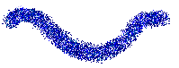
Now you would go back and delete any stray pixels, parts that are overlapping where they don't need to be, etc. Remember, though. Boas (and fur) are supposed to be a little bit shaggy.
And you're done! Of course, this one was rushed, so I wasn't as precise as I normally am, but the main point is still achieved, lol. You also can get a lot more control in PSP, as well, but the results are still pretty good in Paint, lol.